Data Visualization
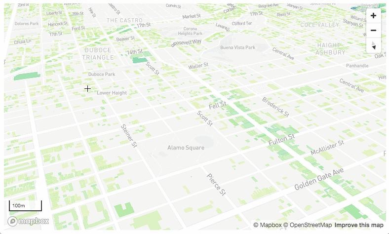
One of the most exciting aspects of new mapping technology is to give us new ways of seeing cities. In this case, overlaying the existing built form and the allowable zoning heights in San Francisco and highlighting the areas of the biggest differential. This is a great example of an intuitive visualization of complex data sets that helps in understanding city structure and highlighting development potential.
It made us start to think about changes to the planning approvals process and how we can use technology to find sites that meet Provincial Planning Policies and growth targets...stay tuned...
https://miro.medium.com/max/1400/1*peHwfZpt4YKeeRcAFYSJOw.gif